Once again, the editorial team invites you to join us as we take a deeper look at some of the maps featured in the Atlas. In these semi-transcripts of our informal conversations, we offer personal opinions about what makes each map interesting. We do not speak for the author, nor are we offering an Official Atlas of Design Opinion. Instead, we just want to take a moment to engage with these intriguing works and invite you all to think more deeply about what’s going on in each one, which is one of the goals of our project. The following is a conversation about Barry Richards’ FindARoom—a website for searching rooms at the University of South Wales and is featured in the new, second volume of the Atlas of Design.

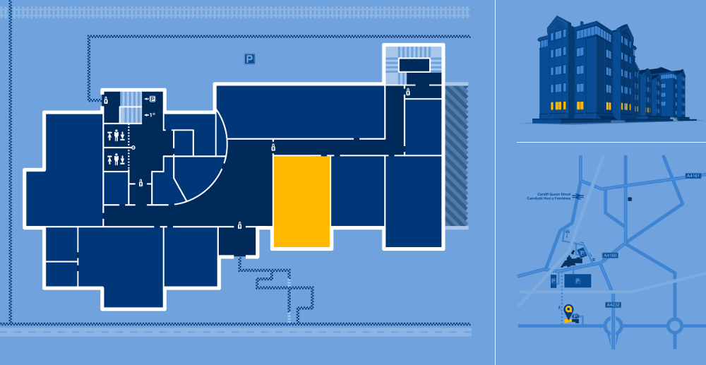
Daniel: Strong statement of style. This is an institutional product that has a strong personality and is quite unique. It’s a great piece of branding for the University of South Wales, and one that stands out against other campus maps.
Marty: That’s a good point: when you’re designing things in a utilitarian mindset, there’s a sort of assumption that you can’t also make it aesthetically strong.
Interestingly, the university website doesn’t look like the map in regards to style.
Daniel: It’s actually not much different than a standard floor plan map except for the colors. Someone could put the exact same floor plan in black and white and it would get the job done. This splash of color, though, makes it much more interesting than a standard floor plan.
Marty: The linework is thick in general and abstracted in places, which makes for a unique map style.
Sam: The legend is very in depth. Interestingly, the map is completely rendered in SVG down to the small checkered paths each being their own object. I would love to learn about the automation that went into this work and design.
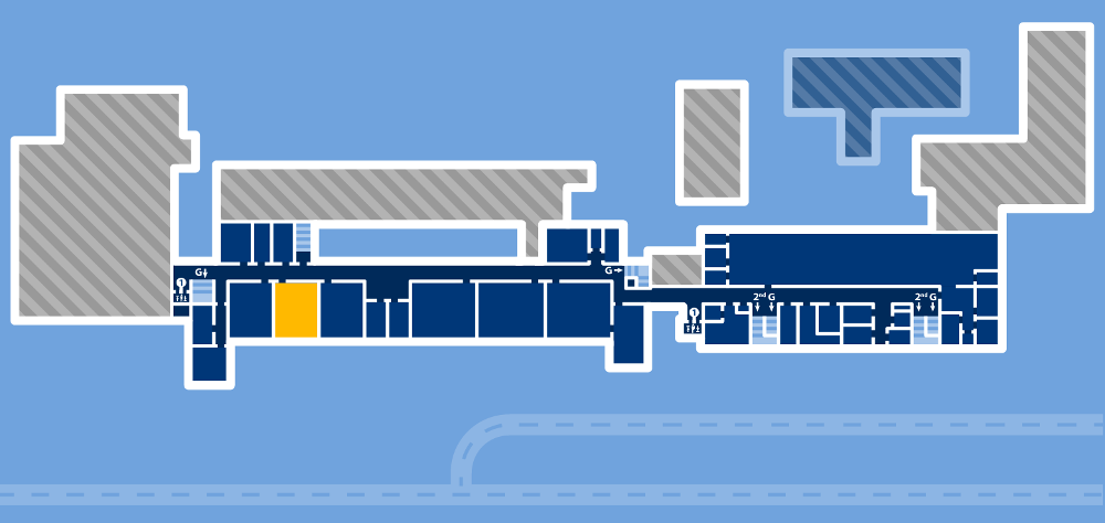
Daniel: I’m looking at a floor that has a large, internal void space. I guess this is part of the building that is no-man’s land.
Sam: It must be an atrium or something.
Daniel: Or possibly not publicly accessible; closed off.
Marty: It’s not of this dimension.
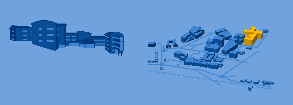
Daniel: I love the 3D renderings of the buildings that are attached with the map here. It is generalized and simplified, but completely ties you to the reality of the building you’re viewing and makes you recognize it when you’re there.
Sam: It’s really neat how these pages connect the 3D rendering with the floor plan, showing the level of the floor tied with an appropriately lit up color in the 3D building.
Daniel: It’s particularly helpful because of all the hills on this campus that make the “entrance” to the building on irregular floors. You could be entering on the basement level or the 3rd floor, depending on which side of the building you’re approaching.

Sam: I can see this being incredibly useful for new students and everyone in the first week of the semester when you get your class schedule and a list of rooms but have absolutely no idea where you need to go within the buildings. There’s something to be said about finding it on your own, but this would be really great to have so you’re not late for those first few days.
Daniel: This is almost the opposite of some of the maps we’ve talked about previously, which are not geared to finding something specific on the map. FindARoom, however, is made purely for finding specific, known entities.
Marty: Moreso than any other map in the Atlas, this was made to solve a specific wayfinding problem. That’s really fascinating in the sense that maps can still do that. We have good road maps and everything, so the use of maps as a wayfinding tool has less opportunity when it comes to creativity and charting new areas. This website made me happy and took me back to the roots of why cartography is so great. Nowadays you can forget about the purpose of maps as a wayfinding tool.
Daniel: We also spend so much time professionally pushing against that public perception. As cartographers we’re constantly saying “We are not Google Maps” and find ourselves in a different spectrum than wayfinding… but it’s an incredibly important thing! This is certainly not Google Maps.
Marty: It’s special.
Daniel: It’s classy.
Sam: It’s so out there.
Sam: I wonder how this project came about. To me it seems like it would have had to start out of personal interest or potentially a thesis and only when it became potentially useful did the university see it as a product to officially put on their website.

Marty: Indoor cartography seems really… underrated. Nobody really talks about it, and it seems really ripe for exploration. I wonder why…
Sam: I think you could probably make an argument of resources and priorities. It’s not something that can be done quickly for sure. And if you’re thinking about how many other data related projects a university can work on you’d probably see indoor wayfinding lower on the list. Maybe they see simpler solutions like “better signage” within buildings as a quicker, cheaper option that could have an equally positive effect.
Marty: As a resident of Minneapolis, if there were good cartography for the indoor skyways it would be the absolute best.
Sam: As a web designer and cartographer, I’m really excited to see something so unique come out on the web for the mapping world. We’re so used to seeing slippy maps and thematic maps, but this is something incredibly new and unique that can push the boundaries of how we currently see cartography on the web.