Join us as the editorial team takes a deeper look at some of the maps featured in the Atlas. In these informal conversations, we offer personal opinions about what makes each map interesting. We do not speak for the author, nor are we offering an Official Atlas of Design Opinion. Instead, we just want to take a moment to engage with these intriguing works and offer you all a chance to think more deeply about what’s going on in each one, which is one of the goals of our project. The following is a conversation about a Jake Coolidge’s The Columbia River Watershed—a hand-drawn map featured in the new, second volume of the Atlas of Design.
Marty: I was able to listen to Jake’s talk at NACIS about the creative process behind the map. What was really striking is how curated it is; he talked at length at what sort of human vs. natural landscape features he wanted to include.
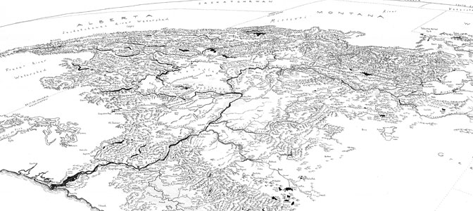
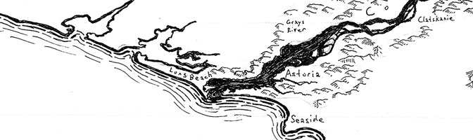
Sam: I thought the hatched areas were urban upon first glance, but they actually are agricultural areas. Seems like a great thing to include because of the effect agriculture can have on a watershed.
Daniel: I love the fact that he’s bringing back Erwin Raisz, whom he credits as his inspiration. There isn’t enough Raisz stuff these days—he was active in the mid-twentieth century. This map references his physiographic diagrams to take geographic data to their logical conclusion, devising iconology for every type of terrain (i.e. different icons for different types of mountains).
Daniel: It has this storybook quality to it.
Sam: It definitely has a fanciful quality to it, making me want to explore the path from one point to another (shoutout to Middle Earth).
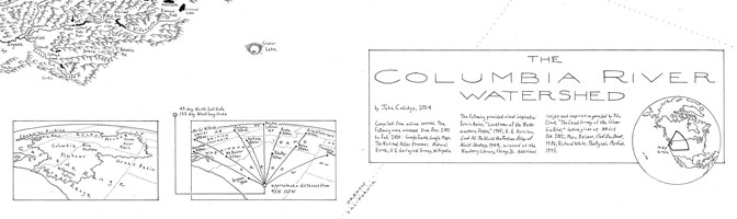
Marty: The oblique view and northeast facing nature makes it hard to tell where all of the borders are, and the actual geographic extent of the map, until you look at the insets in the middle.
Daniel: Oblique views are incredibly powerful, pushing you into a perspective that a standard (plan) view doesn’t allow. There is more of a reality, or an immediacy in seeing the curvature of the Earth. It’s more immersive and arresting to see this perspective.
Sam: I’m happy Jake wrote about using the curvature to portray the vastness of the watershed, which must have been incredibly difficult to keep those curves in mind and yourself oriented when drawing all of the mountains and details.
Daniel: Why do people like these hand-drawn maps?
Marty: It makes the amount of work and thought that went into the map very evident, whereas a digitally produced map can be taken for granted. I think Jake mentioned that the mountains are, of course, not one-for-one on the map. But it’s important to note the major peaks, like Mt. Rainier and Mt. Hood, are drawn more true to life.
Daniel: That’s a very good point: it’s obviously laborious.
Sam: It’s amazing looking at each of these mountains and thinking how each of them has to be drawn with shadows and perspective details instead of hitting the button in ArcMap to add your light source.
Daniel: I was reading a piece about the existence of sea monsters in maps. First, they were not very common, and secondly, they were largely a sign of wealth and status of the person who paid for the map. Because it cost a lot of extra money to hire an artist to add those, therefore the more embellishments you had represents your available income. The elaborateness and effort in this map is what we appreciate about it. It’s the time you take to look at this map that makes it stand out, and may not catch your eye as you walk by.
Sam: It makes me feel like I’m looking at a Where’s Waldo book. I could stare at a new little piece of this map every time and find something new.
Daniel: You need to put that in the write-up.
Sam: One thing that I find really interesting, with the very limited amount of drawing I’ve done in my life, the paths of the rivers as they get smaller and smaller look real even if they are scribbles and intensely generalized. Even though someone is drawing it, it makes you get a sense of the watershed bending naturally.
Daniel (disagrees!): When I look at these lines, I have this feeling of imprecision—take someone visiting this area in the 18th century, they wouldn’t get every bend and detail correct. I think hand-drawn sort of implies that things are generally fine but not accurate.
Sam: I suppose I agree, but there still feels like an intention to make these would-be-scribbles seem relatively life-like.
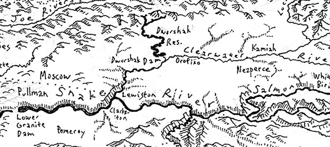
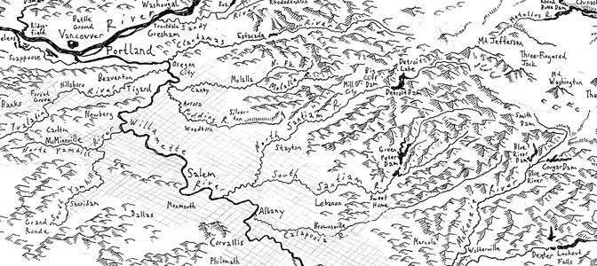
Marty: There are a few rivers further back in the map that are rendered as hachures.
Daniel: Also note the hachures representing canyons the rivers are flowing through.
Sam: There are two types it seems— the hachures that represent the valleys of tributaries and the hachures that are representing canyons. Like the Snake River you’ll see a gorge, but near Clearwater you’ll see little tributaries.
Daniel: The most negative thing I have to say about this map is that there are still some leftover erasures, it’s not very easy to read in some lettering.
Marty: Do we know how large the original drawing is?
Daniel: Well we know it’s 1:1 in the spread in the book, in regards to the file that was provided to us. It seems reasonable that this is the size. Much larger wouldn’t do much more.
Sam: There are some really perfect type on the map, but also many imperfect types, which I can totally sympathize with since I wouldn’t want to write all of those!
Daniel: There are some places, like in the title, that feel “blueprint” like—with the lettering that reminds me of the font you have to use as an engineer or architect in school—it seems to follow that common set of forms. This makes it seem more precise, but when you dive into the actual map it represents a more old-time survey look.
Sam: Daniel, what do you think about the waterlines?
Daniel: Appropriate thematically. I like how they are dashed: it represents motion and tide-like movement.
Marty: Also, the varying stroke widths are important for that sense of motion.
Daniel: Does this map appropriately represent the landscape?
Marty: Yes.
Sam: I think in the context of what the map was written for it does a great job, especially by only showing natural features and references within the watershed.
Daniel: Yes, otherwise this map would be an impregnable mass of mountains and features. Confining to the watershed focuses to make something out of the chaos.
Sam: I enjoy how you can really see the boldness of the river and follow its dispersal as you go inland. If you’re near the Missouri, for instance, the river gets lost in the mountains and lakes, but that accurately represents the spread of the watershed, rather than focusing on what is actually a pretty small river at first.
Daniel: This map is not a map to approach with a goal of intending to determine a specific thing. It’s difficult to find something if you are looking for it, but simple to find many things without intention. Perhaps, it is as the landscape itself. We should not attempt to apply our human, intellectual constructs to it and we should simply appreciate nature as it is.