Join us as the editorial team and some of our guest judges take a deeper look at a few of the maps featured in the Atlas of Design Volume 6. In these segments, we offer personal opinions about what makes each map interesting. We do not speak for the authors, nor are we offering an Official Atlas of Design Opinion. Instead, we just want to take a moment to engage with these intriguing works and offer you all a chance to think more deeply about what’s going on in each one, which is one of the goals of our project.
The following thoughts are from Aaron Koelker, of the Volume 6 editorial team.
Bathymetric visualizations in Le pertuis d’Antioche by Marine Le Breton, and Murky Waters: Unmapped Areas of Seafloor by Andrew Douglas-Clifford.
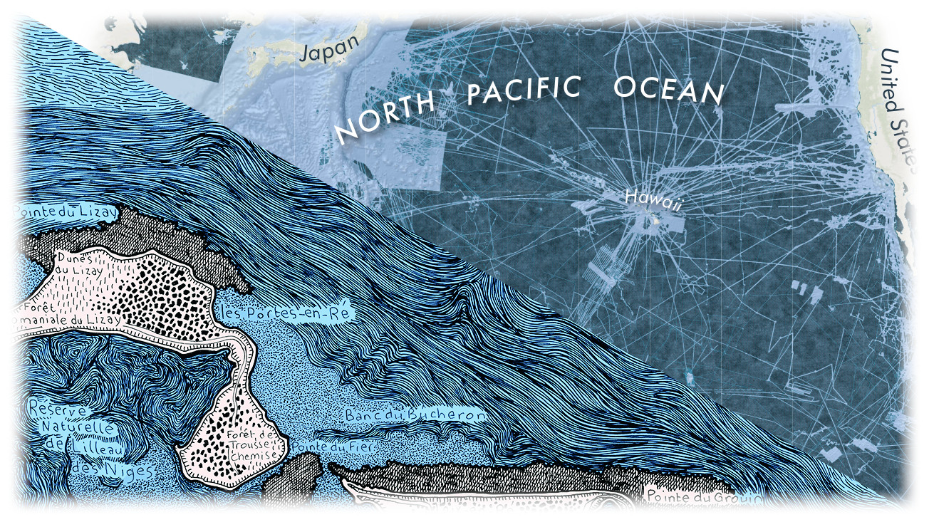
The thing I admire most about Marine Le Breton’s map, Le pertuis d’Antioche, is the way it depicts such a complex assortment of water features. Simple variations in line patterns help differentiate the region’s various levels of sogginess; from areas of inland aquaculture and natural salt marshes, to tidal flats, shallow straits, and the deeper depths of the sea. Longer lines packed in dense weaves provide a sense of movement in the turbulent shallows, where shifting tides funnel seawater in and around the nooks and crannies of the coast. Squashed, organic coils resembling the warped shells of oysters indicate where they are grown and harvested in the inland marshes. And heading out toward the middle of the bay, the lines incrementally shorten and increase their spacing, emulating the calm of deeper waters, and their meandering paths suggesting the whirling eddies of ocean currents. The map lacks any sort of legend or guide to decipher these patterns, however, instead letting the patterns themselves do the work.
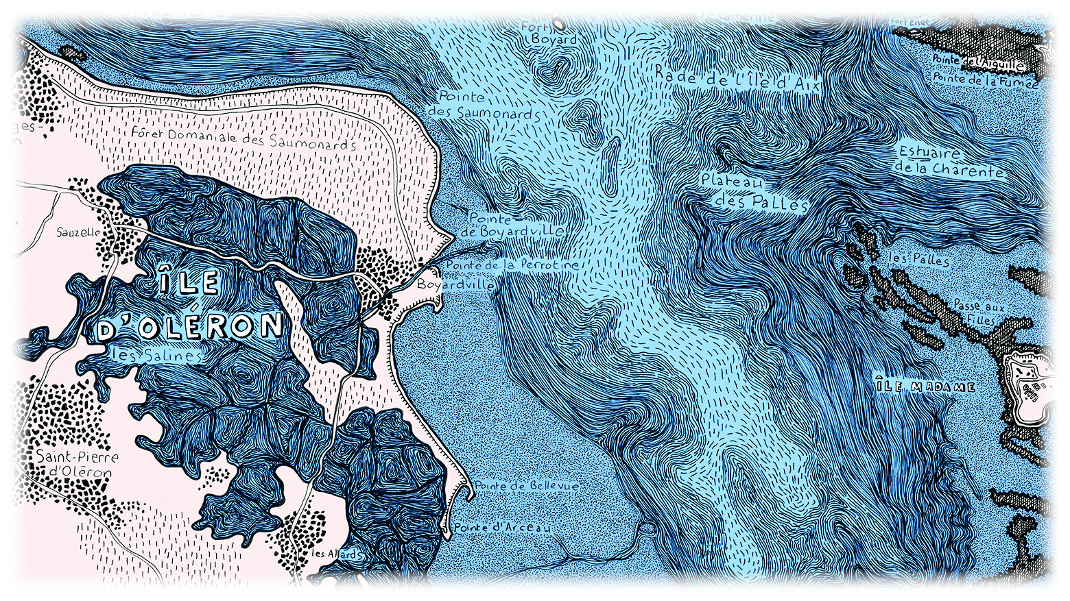
What you also won’t find here are channel markers, soundings, and other aids to navigation (though lights are marked with small stars) that you’d typically see on a nautical chart. And while the lines are drawn with precision, they don’t necessarily denote accuracy of placement. If you look at some satellite imagery of the area, you’ll see this is a fairly abstract portrait. The map veers closer to an art piece than a functional tool that you might use to navigate, but in lieu of accuracy, navigation, or any sort of true bathymetric data, the design choices here all work toward a common goal of bringing the reader to a certain feel and understanding of the place.
Somewhat in contrast, Andrew Douglas-Clifford’s map, Murky Waters: Unmapped Areas of Seafloor, puts real-world data at the forefront and depicts its bathymetry in absolute terms. While Le pertuis d’Antioche mostly skips any references to hard data, here, the very existence of data (or lack thereof) is the focus of the map. Most maps are made to show where things are, but this one is really highlighting where something isn’t. The map projection (Spilhaus) presents our oceans as a single body, rather than the fractured segments we see in most maps, and helps better emphasize the large gaps in our global bathymetry data. It does a wonderful job of conveying to the reader just how little we know about the ocean floor.
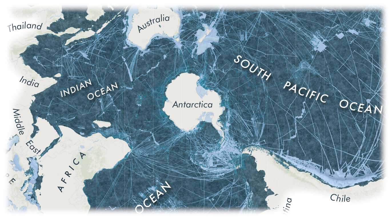
I also particulary like how the thin, jagged lines of what’s been collected over the dark background of the unknown make the entire thing feel a bit like a scratch-off ticket, or those rainbow scratch papers you might have once been handed in art class. It really gives you a feeling of progress being made and revealing what lies beneath. This is also strengthened by the use of texture in the map’s unknown areas—the mottled coloring suggesting potential underwater canyons, trenches, and seamounts waiting just below the surface. If instead the map had used only a flat color, it might give the impression that there isn’t much of anything to be found in these unexplored areas.
At family gatherings and social events, one of the common responses we as cartographers hear when informing someone of our profession is something along the lines of “…but hasn’t everything already been mapped?”. Often we might attempt to explain GIS in a nutshell or tell them that maps aren’t just about charting places so much as things, etc.—but here is the sort of map one can triumphantly point at and say “As a matter of fact, no! We have not mapped everything! Behold, the unknown!”
One of the (very many) things I love about maps is their ability to spark the imagination, and while both of these maps tackle the same environment (at very different scales), they can tap into the imagination in entirely different ways. The first provides a specific vision of a well known place, acting as a visual guide to provide a certain feeling about it—without getting too bogged down in real-world specifics—and leaving room for readers to make some of their own interpretations of what that place might be like. The second presents an incomplete portrait of the real world, contrasting the known from the unknown, and invites the eye to wander into its empty spaces, to wonder what lies below, still waiting to be discovered.
You can find more of Marine Le Breton’s work on Instagram at @lescartesmarines.
You can find more of Andrew Clifford-Douglas’s work on Twitter at @themapkiwi.