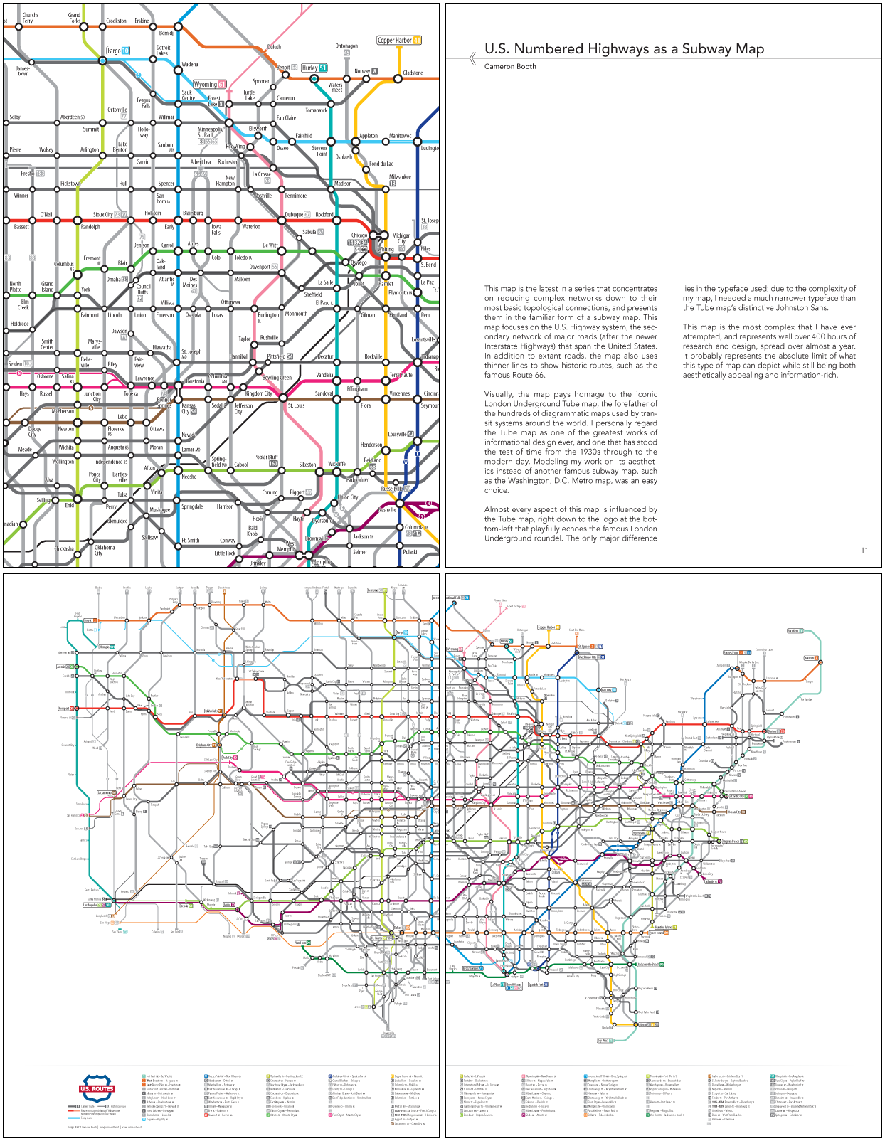
For the third in our series of short interviews with Atlas of Design contributors, we bring you Cameron Booth, brilliant designer, transit map nerd and cartographer of U.S. Numbered Highways as a Subway Map. Cameron is a graphic designer, photographer and (d’uh) map-maker. He is a jack-of-all-design-trades, with experience in logo design, typography, and web design. He can be found on the web here, or if you are like us, you can just cut to the chase and follow him on Twitter.
Atlas of Design: We’ve reanimated Harry Beck’s corpse and he’s coming toward your house now. What will you guys say to each other?
Cameron: I’d tell him that I think his London Underground diagram is one of the foremost and influential pieces of informational graphic design ever, and is still in use today, adopted the world over by almost every transit agency and budding map designer. He’d just say “BRAAAIINNNSSS!” and then things would get a little awkward.
AoD: Are transit directions on our phones making us better or worse as navigators?
Cameron: Judging by the outcry over the removal of transit directions from iOS6, it’s made us far, far worse. Apparently, we are now absolutely incapable of catching a train or bus - something that humans had been doing for almost a century before the iPhone - without a little gizmo to show us the way. Personally, I’ve successfully navigated many transit systems in the US and Europe using only printed maps and my own sense of direction, so I’m not actually all that upset about the loss of transit directions on my phone.
AoD: Where is D.B. Cooper?
Cameron: I’d tell you, but he said that I wouldn’t get my share of the cash if I did.
Yes, there will be more interviews as we count down to the official release of the Atlas! To keep up to date, subscribe by email or RSS using the links to the right, or follow us on Twitter and Facebook.
