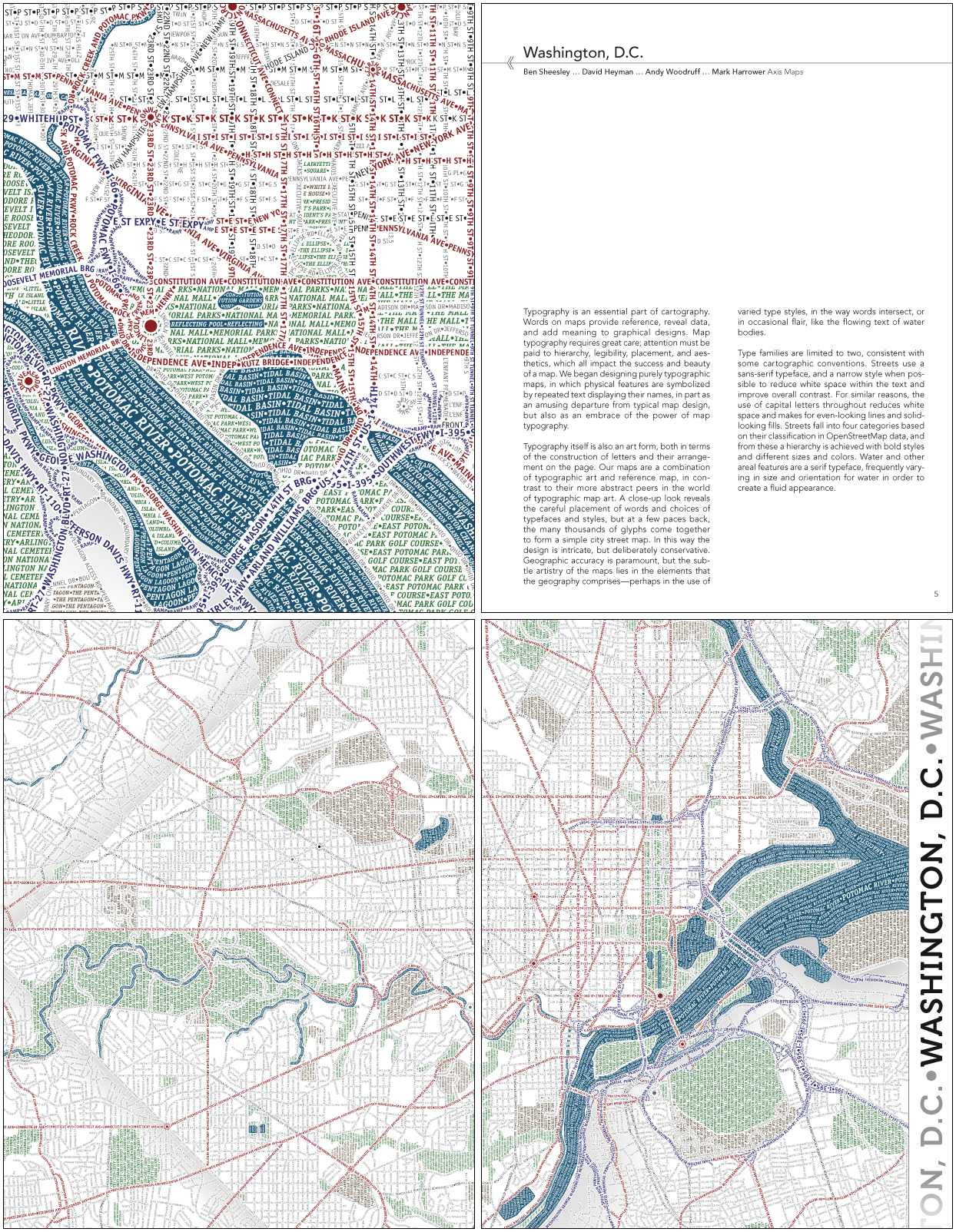
To give you all a chance to learn a little bit more about the brilliant folks whose works fill the Atlas of Design, we’re kicking off a series of three-question interviews with some of our contributors. Ben Sheesley, one of the minds behind Axis Maps, was kind enough to agree to be our first subject. Axis’ typographic map of Washington, D.C., is the first map featured in the Atlas, and you can see a preview below.
Atlas of Design: “Axis Maps” — isn’t that kind of a sinister company name?
Ben Sheesley: Yeah, but we always try to use our powers for good, not evil. The name really just comes from the mathematical and geometrical use of that word, as in ‘the earth revolves on its axis.’ We’ve always been more interested in cool maps than world dominance.
AoD: Myriad Pro — defend your typeface choice!
Ben: Narrow and condensed fonts are great for typographic maps because they allow us to squeeze more letters on a line (or in an area). This makes for a nice, dense overall look and feel, but perhaps more importantly makes it easier to read all those short streets with really long names. Myriad Pro is a huge family with a number of condensed and semi-condensed variants. I’ve also always appreciated its friendly yet professional personality.
AoD: When are you guys going to make some shaded relief maps with type?
Ben: I’ve toyed with the idea of a typographic shaded relief map but so far have been focused mainly on streets. Mapping colored numbers like this has some real possibilities, I think. At one point, I wondered if a hachuring-type of representation would be another approach, with heavier, denser labeling in the steeper areas. There’s probably other ways to think about it, too. I’d love to see someone make an attempt!
More interviews are on the way as we count down to the official release of the Atlas! To keep up to date, subscribe by email or RSS using the links to the right, or follow us on Twitter and Facebook.
