Join us as the editorial team and some of our guest judges take a deeper look at a few of the maps featured in the Atlas of Design Volume 6. In these segments, we offer personal opinions about what makes each map interesting. We do not speak for the authors, nor are we offering an Official Atlas of Design Opinion. Instead, we just want to take a moment to engage with these intriguing works and offer you all a chance to think more deeply about what’s going on in each one, which is one of the goals of our project.
The following thoughts are from Daniel Huffman, former AoD editor and guest judge for Volume 6.
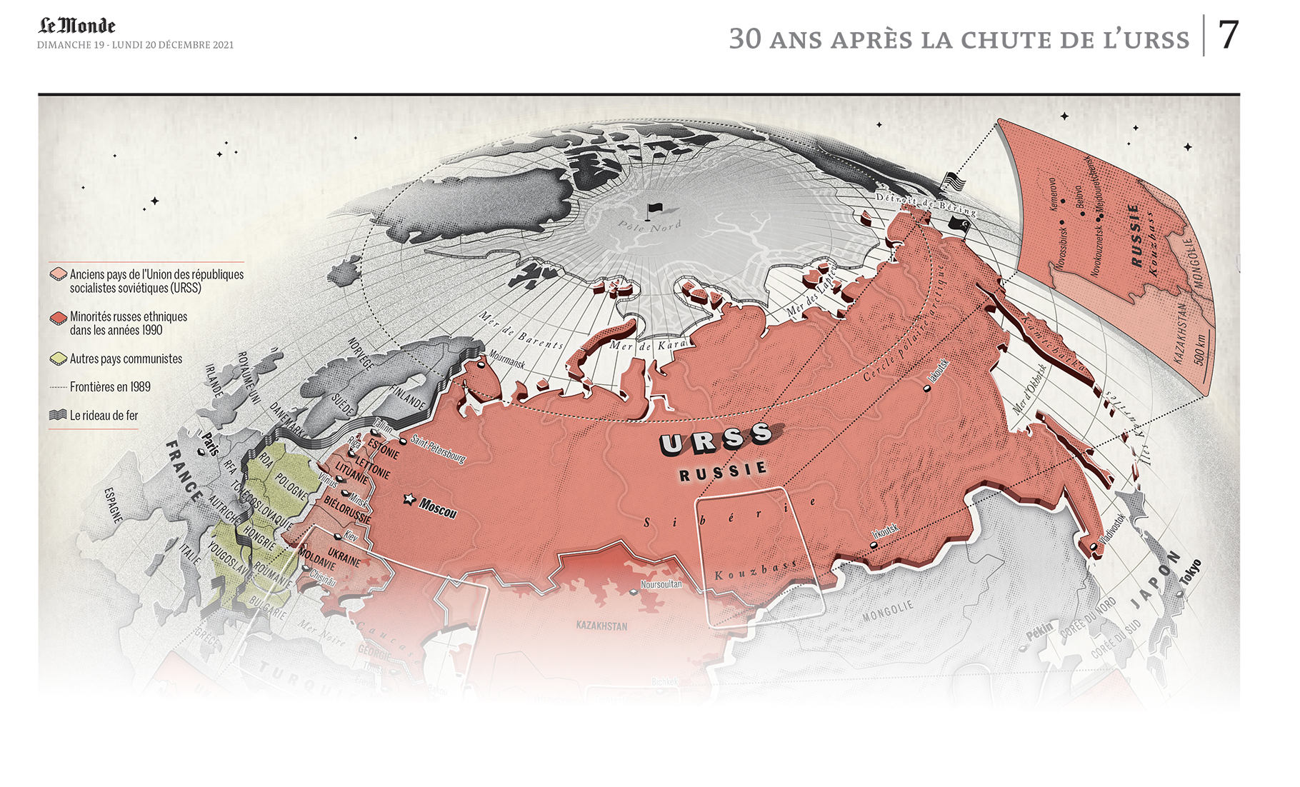
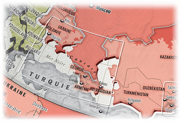
Thirty years of tension and conflict. Contested borders, ethnic violence, Russian aggressions… The shock waves of the fall of the USSR by Xemartin Laborde, Lucie Rubrice, and Delphine Papin — Le Monde.
Let me start by saying that I think Le Monde publishes some of the best news maps I’ve ever seen, and the fact that they were unknown to me just a few years ago speaks the importance of projects like the Atlas of Design, through which I discovered their work. When those of us based in the US think about first-rate journalistic cartography, we usually point to the New York Times or Washington Post, whose staffs are deservedly well-regarded by NACIS members. But there are other organizations out there that are every bit their equal, and it’s been nice to have a chance to encounter some of those through the Atlas.
The USSR is a bygone entity, and this is a map that’s meant to evoke a historical feel. But, many of its elements are also very typical (in my perception) of Le Monde’s distinctive style. If you look back at Volumes IV and V of the Atlas, or just poke around on Le Monde’s map twitter (@lm_encartes), you may see what I mean.
First up, there’s the projection. I am a long-running fan of orthographic and vertical perspective projections. They are immersive and dramatic, bringing the viewer (floating in their spaceship around the earth) into a scene unfolding on a globe, not a flat map. This sort of perspective had a brief surge in popularity in the mid-twentieth century under folks like Richard Edes Harrison and Erwin Raisz, conveying to readers the drama of a global war, and then a global cold war. Projections are not often thought of as an element of style, but they very much can be.
The shaded relief is hinted at with coarse halftone dots. They’re large enough to be intentionally obvious — a little texture that reminds the reader of printed material, even if most of them will view it on a digital screen. Likewise the underlying paper texture and the simple noise that darkens the left/right sides of the globe. More than a few of the maps published by Le Monde evoke the noise of 20th century printing, especially through their frequent use of dots (either as halftones or as simple patterns).
Many of Le Monde’s maps have constrained palettes, relying on tints/shades of a small handful of colors. Here, this is very effective at emphasizing a historical feeling, giving us a map that could (mostly) be printed with three inks. There’s a bit of purple in there, too, but that brings me to another important point: the map does not attempt to completely mimic something you’d find in the 1950s. It borrows from the past and combines it with modern elements.
There are a handful of other niceties worth looking in detail at: the gracefully simplified rivers, the reddish glow on the labels in the Caucasus, the cracks in the polar ice, and more. Good cartography inheres in the small details, and a lot of care has been put into this to give it extra touches that aren’t strictly necessary, but which reward the reader for spending the time to look around. Not every map (especially in a newsroom context) can receive this sort of detailed creative attention, of course. But, it’s worth taking a moment to appreciate it when it’s there.
You can find more of Le Monde’s maps on Twitter at @lm_encartes