Once again, the editorial team invites you to join us as we take a deeper look at some of the maps featured in the Atlas. In these semi-transcripts of our informal conversations, we offer personal opinions about what makes each map interesting. We do not speak for the author, nor are we offering an Official Atlas of Design Opinion. Instead, we just want to take a moment to engage with these intriguing works and invite you all to think more deeply about what’s going on in each one, which is one of the goals of our project. The following is a conversation about National Geographic’s The March to Gettysburg and Back: Turning Point of the Civil War—a map showcasing military movement and life during the Civil War.
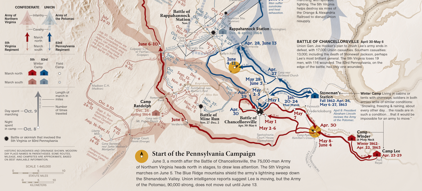
Marty: The details are what make this map really awesome. That’s the number one thing that blew me away when I first looked at this map. The annotations, the notes, the information is so incredibly granular. I can only imagine the number of documents and sources that the team had to dig through and compile to develop an understanding of a battle this immense.
Sam: It’s crazy to think of how to mentally organize this map before you would even start making it. You have to think they had thousands of pages of notes, and had to order them temporally and geographically, and eventually turn it all into one visual map.
M: That makes me wonder how much original research went into this map. It seems like they pulled in everything from maps and photographs to notes and diaries.
S: There must have been quite a diverse number of professionals putting this map together. You’d need historians, designers, geographers to bring it all together. One thing that I feel is lacking in cartography today is the lack of multi-disciplinary collaboration. Maps without proper research tend to miss the mark.
M: I agree. I see the same tendency for people to employ the cartographer as a subject matter expert. The fact that this map is a collaboration between cartographers and historians is really great. This map lists more authors than any other map in either volumes of the Atlas of Design. They managed to bring so many people to the table and yet produce a single, coherent piece of work.
M: My favorite thing about this map is actually the large photo of the man dressed in his Civil War uniform. It’s actually higher up on the visual hierarchy than the map itself. It immediately frames the whole experience. There’s no question that this map is about the Civil War.
M: The other reason why I like having these photographs on the side is that it helps frame your mind when you start digging into the details. You really start imagining what it was like being on the ground as as soldier.
S: Images of amputation saws definitely have an impact on me.
M: The notes about the weather and environment continue to build the scene for the map.

S: This single, flat piece of information is essentially an entire museum exhibit. I can see these images being wax statues and the dates being a walk-through piece of the exhibit, showing you specific entries and pieces of information as you go. It also kind of makes me think I’m playing Settlers of Catan with the little homes.
S: I have a question: are there meanings to the line densities of the army’s movement?. It looks like there is a quantitative piece behind the lines, but there isn’t anything in the legend saying so. The movement of different factions of the army is fascinating. You can see the cavalry split off at times and then converge with the foot soldiers. It kind of shows the dynamics of an actual military through a march like this. Weather they are intentional or well strategized, I am unsure.
M: The immediate comparison you make with this map is Minard’s famous graphic of Napoleon’s marches. I’ve been a critic of Minard’s map in the past; though it was a forerunner of multivariate cartography, it ultimately leaves out the emotional components of the story. This map also shows a lot of data, but they have also included a qualitative understanding of the subject. It makes the map much more realistic and provocative.
S: There are so many different text hierarchies on the map.
M: There are so many everything hierarchies on the map.
S: Usages of different color to depict the armies; different fonts for different pieces of information. It all seems to work. Look at the text as it follows a particular path. It’s tilted! That makes you instantly recognize these tilted, blue pieces of text pertain to that line throughout the map. It’s amazing how readable this map and the information becomes once you recognize these patterns.
M: The relief itself looks really nice. It perfectly integrates with all of the color on top. It allows you to approach the vast amount of information with however much detail you’d like to learn.

S: There’s very little I can find that I don’t like about this map. Nice work!